
Hunger Games (dark parallels)

I'm a little embarrassed to admit it, but with the release of the film a month ago, I got sucked into the world of the Hunger Games.  I even channeled my inner 13 year-old-girl and read all three books!  According to NPR, Dystopian novels like the Hunger Games are all the rage. A recent story on All Thing's Considered touched on the phenomenon, attributing it to the economic uncertainty of our trying times. Where 'young hero protagonists inherit dark and broken worlds', check it out here if you have the time and interest.  This is all very interesting and so is the movie's commentary on our glitzy media and entertainment obsessed culture. Though, what drew me most to the Hunger games, were the images of the dystopia itself.  Here, the film makers seem to have drawn inspiration from the decadence and austerity of 1920's-30's Germany. First, in brightly colored deco couture that conjure up the glamorous and grotesque subjects of an Otto Dix painting.  Then through architecture, referencing the monolithic classicism of nazi architect, Albert Speer.  In my opinion, you're not hit over the head with it, but there are visual clues to trigger the perception. After all, what better way to depict an oppressed totalitarian regime, than the dark and disturbing imagery of the nazis.  In my post today, I've gathered a few examples to draw these parallels. 

Classically beautiful Katniss Everdeen with her, rather anachronistic, braided hair.
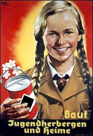
1930's era German propaganda poster

 Standing shoulder to shoulder, the girls of District 12 evoke scenes from a Leni Riefenstahl film.

 Effie Trinket's eccentric wardrobe contrasted with the more traditional sensibility of District 12

Three Prostitutes on the Street, Otto Dix 1925.
 
 affluent citizens of Panem's Capitol City.

Berlin Street Scene, Ludwig Kirchner 1913-24

 Berlin Street Scene, Ludwig Kirchner 1923

Avenue of the Tributes, Capitol City.

Panem's Capitol with it's broad central avenue leading to a domed structure on the horizon. There are shots in the film that even more closely resemble fascist neoclassicism, but I couldn't track them down online.

Albert Speer's model for what would have been a new Berlin, called Germania. Note the geometry of buildings and most similar to Panem, the long central avenue leading to a domed structure. It's effect is brilliantly imposing, a white-washed and conformed, nightmare of a city.  

All of these long avenues, neoclassical monuments, and domed buildings may remind you of another capital city.  But in contrast to the previous two, I think we can all agree that boy did they ever get it right in Washington D.C.  It's such a stunning and inspired cityscape. In contrast, the scale and ornament of the Federal-style uplifts and empowers, serving as a symbol of hope and freedom in the world. You may think me too patriotic for saying it and I know our country (and government) are by no means perfect, but it still remains the best shot at justice and representation the world has ever known. Well, unless Obama loses, I'm kidding. Ha! ; ) But before you go, take a look at this shot of the National Mall from across the Potomac.  Gorgeous! 

Potomac river and Washington D.C. 
(taken with my iphone near the Iwo Jima Memorial, my new favorite spot to spread out a blanket and read :)

a tale of two mansions

Le Chateau de Lumiere, The Building Group Inc.

I caught wind of this story on Huffingtonpost last week. If you would like to read more about it click here. To sum it up, some rich guy with rather opulent taste wants to build the palace (above) in an upscale development outside DC. The neighbors are in an uproar over the scale of the thing and feel it isn't in keeping with "Hidden Springs's traditionally Washington aesthetic, elegant but understated." That part cracked me up because in a way, it is very much in line with the aesthetic of the area. In fact, I think Pierre L'Enfant, the enigmatic architect and engineer credited with designing Washington, would actually be quite pleased with it.

Notice the similarities in the house (below), columns and neoclassical ornamentation, sloped French roof, even little cupolas. Pierre L'Enfant designed this mansion for financier Robert Morris in 1794. Inflated construction costs eventually drove Morris into bankruptcy and the unfinished structure, known as Morris's Folly, was demolished. If history is any guide, the residents at Hidden Spring need only wait it out.  Ha!  It seems things have resolved themselves, even before I could get this posted.  The homeowner backed out! Folly averted. Read more here

 Morris's Folly, Pierre Charles L'Enfant 1794

Fort Hunt Park, our favorite new picnic spot

I wanted to share the full size photo used in my title bar this month. It was such a glorious sight that day, as if we were walking through some 18th century landscape painting. I don't know, could we get some hunters riding through on horseback, chasing the hounds?

Mercury Summer Stock 2012


I'm so excited to share my latest collaboration with Pierre and Brian at Mercury Summer Stock. This year we came up with the show posters, a promotional brochure, and a new logo that better reflects the creativity of this truly unique community theater co. The amount of talent and enthusiasm that goes into each of their productions is an inspiration to me. If you'd like to learn more about MSS, check out their site here. I just hope we get the chance to be back in town for a show this Summer - break a leg guys!

OH and I want to see one of these Backstage parties.. for myself! ; )

Spring 2012


Hard to believe we've been in DC a little over year now, it sort of feels like we just got here. I'm still trying to figure out my way around the place! The seasons changing, as always, helps to give you a little perspective on things, horizons and prospects seem to be brightening all around. Hope it's finding you well too!

Now if we could just find a place to get a decent mojito...!

Spencer in polo


For the longest time I've been frustrated that I can't find dog clothes large enough for Spencer out there. And then I realized something, my old shirts fit him just fine! Here he is sporting a Penguin polo $38 Nordstrom

national arboretum


capital detail, yep I shimmied up a column to get a better look! ; )


Bonsai Tree

Capitol dome and DC on the horizon

Gorgeous weather and restless dogs led us (finally) to the National Arboretum this past weekend. Of course, my favorite feature, (pictured here) is the freestanding Corinthian colonnade prominently atop a hill at the center of the park. Against the blue sky, these giant columns feel like something out of a surrealist painting. ...or at least Athenian ruins. As with everything in this city, there is a historic back story. These sandstone pillars originally supported the U.S. Capitol's east portico (1828), but were replaced with marble columns during an expansion in the 60's. As you can also see, the trees and flowers are just beginning to blossom - there's a sweetness in the air that lifts your spirits a little. Hope you're enjoying the same!

the Frustrated Artist (home movie)


With all the buzz out there around the silent film the Artist, I thought this would be a good time (and perhaps the only) to share with you this home movie I made in my parent's backyard in 1992. I grew up idolizing the silent greats, especially Chaplin, who is obviously my inspiration for this somewhat lengthy, but noble effort. Ha! I was 12! Anyhow, when I was last at home I converted all the old tapes to dvd, edited what you see here in imovie, and used the 8mm app to give it that vintage feel. Hope you enjoy!


p.s. let's make a movie sometime : )

ABC world cities book

Athens, Greece - Acropolis


Copenhagen, Denmark - Canal Scene


Freetown, Sierra Leone - Market Scene


Guatemala City, Guatemala - textile market
Katmandu, Nepal - Ancient temples of Durbar Square


Prague, Czech Republic - Prague Castle Guard

Rome, Italy - the Colosseum

San Juan, Puerto Rico - El Yunque National Rain Forest
San Juan, Puerto Rico - El Morro fortress
Tokyo, Japan - Kabukicho district
Zagreb, Croatia - Zagreb Main Square w/ statue of Ban Josip Jelacic

*Details
Colosseum (detail)

San Juan Toucan (detail)

Kabukicho district (detail)

Zagreb Main Square (detail)

These are part of an ABC handwriting book for Sterling Publishing. As everyone around me can attest, this was my life these past couple months. I just got the okay to share a few, so here they are from the top; Athens, Copenhagen, Freetown, Guatemala City, Katmandu, Prague, Rome, San Juan, Tokyo, and Zagreb. I'll post more from the series when I can. Thanks so much Meredith, you are the best! Can't wait to see the finished product! Get your's here!

Jesus Christ Superstar


Where does the time go? I know I've been away, but I hadn't realized it had been so long! This is my latest collaboration with Brian and Pierre at Mercury Summer Stock. Check it out, it's a great cause. I liked what was happening with the Superstar so I included a detail.

3x3 Annual 2012

cover: Wonil Suh

The 2012 3x3 Annual in the mail yesterday and it cheered me up. Looking through all the cool stuff, I was surprised to see these! No one had let me know I'd made it in this year. I'm most proud of the teacher piece. When I see it, I think first and foremost of Mom and how much she loved her kids. I think of my own teachers Mr. Portwood, Mrs. Hunter, Mr. Geist, Mrs. Wunker, and Mr. Herd. I think of my middle school art teacher Bob Lynn. I think of you Mrs. Robinson, I can still recite All the World's a Stage, I think of you Susan Story, though I never sat in one of your desks, you've helped us in so many other ways all the more. I think of Ms. Hazel Haley who taught highschool English for 69 years! ...even teaching a Governor of Florida. I think of Frau Chapman, my German Leherin, I think of Rebecca Sexton Larson, Karen DeMichael, and Rocky Bridges - you guys are such amazing artists! Sending out a BIG thanks to you all today for all the good that you do! Do you realize how much you shape us?

Stanley Clarke Box Set


I'm playing catch up today - a few months back, Edward from Sony came to me with this job. Half the fun with working with you Edward, is catching up on the phone, always a treat! He just needed a black line art bass guitar to drop into his design. Here it is! After giving Stanley a couple hearings, I'm not sure he's my thing, but I absolutely love the music genre. Let's work together again Edward!

Vintage Care Bears


You know I don't think these ever went anywhere and for the longest time I didn't know what to do with them. But I figured what the hell, I'll share them on here today. Ryan from American Greetings came to me with this concepting job a while back asking the question, what if the Care Bears had been around in the 1930's? What would they look like? These were the results of another fun collaboration. Hope its okay if I post them...


Season's Greetings 2011


Surprisingly, Brad couldn't find Christmas cards with the White House out there. So, being the fabulous boyfriend/marginally talented greeting card designer that I am, I offered to help out. ; ) We thought it'd be fun to really play it up with script lettering, an oval frame, and crisp white on cream envelopes to make it all as 'Presidential' as possible. This was the end result, it's very 1968 LBJ administration to me. As for this Christmas 2011, wishing you all the best, have a wonderful holiday!

Mercury Summer Stock 2012


We're working on the upcoming season's promotions and so far this is my favorite. It began as one of those 'what the hell am I going to do with this situations?' I mean, whatever you think of the play or the original poster, they're icons, and so what business do we have even approaching them? But as I played around with it, I grew to like what was happening. I wanted it to be bright, bold, and completely different. I'm just not sure how limited I should go with the palette. I'll keep at it and will post the others soon.